While everyone is trying to beat the heat, not everyone is experiencing heat the same way. Those who reside outside Loop 1604 have a different experience with heat compared to those who live closer to the city core, many of whom are living in “urban heat islands.”
According to the U.S. Environmental Protection Agency, heat islands are urbanized areas that experience higher temperatures than rural areas due to the lack of green space and the high concentration of buildings and other infrastructure that absorbs and re-emits the sun’s heat.
However, “urban heat islands” can also take place between neighborhoods inside cities, as some neighborhoods have more pavement and concrete where other neighborhoods have trees and greenery. Eighty-eight percent of San Antonio’s population live in urban heat islands, according to Climate Central.
“When we design cities, we are changing the structure of the environment,” says Kristen E. Brown, an assistant professor in civil and environmental engineering, and construction management. “In order to make things accessible, we have roadways, but those roadways are covering up what could be a field. When you add extra pavement for those mobility purposes, you add various things that are producing waste heat and removing ways for heat to leave the system. This leads to urban environments being a couple degrees hotter than rural environments.”
In 2022 and 2023, Brown and her team of researchers from the Sustainable, Pervasive Urban Resilience (SPUR) Center tasked by the City of San Antonio to determine what areas are most affected by extreme heat with the goal of directing resources to those most impacted. The team, led by Brown, included Esteban López Ochoa, associate professor; Ryun Jun Lee, assistant professor; and Wei Zhai, assistant professor of urban and regional planning. Klesse College graduate students Samuel Rueda, Allison Pineda and Christina Kastely were also part of the project.
“We know that it’s super hot outside, and that is problematic because people get sick. No one wants that to happen. So, the city wanted to be able to start taking action to bring temperatures down,” Brown says. “Our goal was determining where the hottest places are and then the most vulnerable places.”

To determine the hottest areas, the researchers analyzed satellite data from the Landsat program by NASA and the U.S. Geological Survey over a course of four days across four months.
Brown adds that when looking at collected data, including the air temperatures, on different days, there was consistency in certain areas of San Antonio during those four days. The satellite data was also compared to ground measurements that were taken with monitors around the city.
Based on collected and calculated data, block groups of the city were assigned heat rankings between 1 and 10, a ranking of 10 being the hottest.
Causes of Urban Heat Islands
- Reduction in natural spaces such as trees, bodies of water and vegetation.
- Increase in human-made materials such as pavements and roofs.
- The space between urban buildings affects the airflow, which would allow for cooler effects.
- Weather and geography can also factor into the formation of heat islands.
Source: U.S. Environmental Protection Agency
The researchers found that the hottest areas in San Antonio were inside Loop 410 and areas within U.S. 90, Interstate 35, Interstate 37 and Interstate 10, just outside the heart of downtown San Antonio.
“You might expect the heart of downtown to be the absolute worst, but it seems that the existing parks and stuff are helping cool it,” Brown says. “It’s just outside the heart of downtown, inside Loop 410, where it tends to be where all of the hottest areas are and especially on the south side and west side of town,” Brown says.
The study also looked at different variables such as income, access to healthcare, and access to transportation. Like the heat rankings, block groups were given scores from 2 to 10, with higher scores representing higher populations of color and lower median income.
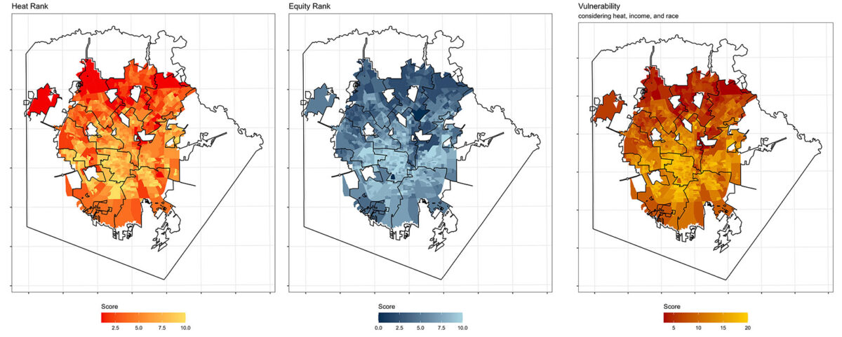
Heat Map: The higher numbers on the score bar indicate the hottest areas of San Antonio. Equity Map: The higher numbers represent areas of lower incomes and higher percentages of the population, including people of color. Vulnerability Map: The higher figures showcase the most vulnerable areas. Maps Courtesy of Kristen E. Brown/Klesse College.
Using all this data, the researchers created a Heat Vulnerability Index and map to show which areas are more susceptible to extreme heat.
With the help of the index, the city has now launched the Cool Neighborhood Pilot Project, which will coordinate efforts across several CoSA departments to combat urban heat in four neighborhood sites in District 2, District 3 and District 5. The pilot project will utilize several existing programs such as the CommuniTree program, Under 1 Roof program and the Casa Verde program with CPS.
“The Heat Vulnerability index gave us a roadmap of where we should be paying most attention. Heat does not respect boundaries. It’s affecting all of us, but we know there are certain environmental issues that make heat more impactful to certain residents,” says Leslie Antunez, City of San Antonio sustainability administrator. “This index has been our starting point to see what relief we can provide for our residents.”
OTHER STORIES IN THE SERIES:

Researchers from UT San Antonio are turning to AI models and digital twin technology to strengthen resiliency to urban heat in San Antonio’s Historic Westside community.
Researchers are partnering with the City of San Antonio to create innovative solutions to beat the heat.

Two research projects from UT San Antonio explore how effective cool pavement is for mitigating heat.


No comment yet, add your voice below!